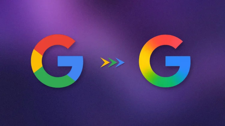
Google is updating its well-known “G” logo with a refreshed design that keeps the original blue, red, yellow, and green colors. The new logo features a slightly more open shape with adjusted curves and proportions, giving it a cleaner and more modern look.
This update is not a major redesign but a careful refinement to make the logo clearer and more adaptable across different devices and screen sizes. The goal is to keep the logo recognizable while improving its appearance for today’s technology.
The change reflects Google’s focus on innovation and enhancing user experience. The new design blends the colors more smoothly without clear borders, a shift from the previous style introduced in 2015 when Google switched to a Sans-Serif font.
Currently, the updated logo is visible on Pixel phones and will gradually appear on other platforms as the rollout continues.